
I just wanted to do a quick follow up to my recent blog post, which discussed the performance metrics I think might be appropriate for use in medical AI studies. One thing I didn’t cover was the reason we might want to use multiple metrics, or the philosophy behind choosing the ones I did.
So today, a diversion into the question: what is performance testing for, and what are the features of a good metric? We will get a bit math-y here, but I prefer concepts to numbers most of the time, so hopefully even the math-naive among us can follow along.
Note: many thanks again to my supervisor/colleague Andrew Bradley, who is the expert in this area. All of this is received knowledge from him, and his reviewing and editing of this piece have improved it greatly.
Entering the third dimension

We can define the performance of a decision maker as the probability that it gives the right answer. While this sounds straight-forward, it is much more complex than it seems.
This is because we don’t only want a measure of probability. In research, we want to communicate our results. We want metrics that are easy to interpret, and easy to compare.
This is tricky, because there are three factors that influence the performance of decisions made by humans and machines:
- the expertise* of the decision maker
- the bias of the system, otherwise known as the threshold
- the balance of the outcomes, otherwise know as the prevalence
The important thing to understand here is that the expertise is inherent to the decision maker, and the bias is controllable. The prevalence is a feature of the data, and thus not under our control. This means the two dials we can play with to improve decision-making performance are to get a better expert (i.e, train our current expert more), or to choose a different threshold.

The key take-home message for this post is that we need to understand how these factors are are influencing performance, to know how to make better decisions. Unfortunately, it isn’t easy to disentangle these factors with most metrics.
I like to think of these factors as dimensions, because it makes the difficulty humans have understanding how the factors relate to each other more obvious. Humans are really only capable of grokking one and two dimensional data, so we ideally want some summary of our performance that is either a number (1D) or a plot (2D).
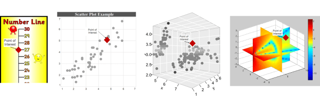
Visualising data in 1D, 2D, 3D, 4D. To get a feel for interpreting multidimensional problems, try to work out where the point of interest is relative to the rest of the points. I’d argue that interpreting 3D and 4D spaces adds a significant cognitive burden.
You can actually describe your position in any space with a single number, a trivial example would be adding the values along each axis together (a measure called the taxicab distance). Unfortunately this doesn’t tell us much about where you are; in the picture above, instead of having a point floating in space (a 2D representation), imagine just having the number ’27’ and try to work out where it should be. It works on the number line, but for the higher dimensional spaces it becomes increasingly vague.
This is a mathematical truism. To completely specify a location in a space, you must describe it with as many dimensions as the space has. A description with fewer dimensions allows for residual degrees of freedom; directions where the position is not defined. If we say a location on a 2D space has a taxicab distance from the origin of 28 units, all we know is that it exists on x + y = 28, which is a 1 dimensional line.
This is true more generally. A m-dimensional description in an n-dimensional space has n – m degrees of freedom.

Possible locations for a point in space with taxicab distance = 28. In 2d space, this is any point along the line x + y = 28. In 3d space, it is any point on the plane x + y + z = 28.
This is all well-understood by anyone with a mathematical background, although it is probably a distant memory (or maybe even new) for most of my medical readers. It is necessary though, because now we can clearly define our problem:
- There are 3 dimensions that determine the performance of a decision maker, therefore 1D and 2D descriptions (metrics) are incomplete.
- Humans can only intuitively appreciate 1 and 2 dimensional metrics.
This mismatch is a bit like the no free lunch theorem; we could say something like “there is no single, interpretable metric that can describe the performance of a decision maker”.
So we need more than one metric. Let’s look at this problem a bit more in the context of medicine specifically, and introduce some candidate metrics.
Accuracy without clarity
If we try to capture performance in a single number, we can’t know which of the three factors influenced the number most. I’ll introduce this (slightly altered) picture from Wikipedia here, and we will come back to it later. It is called an extended confusion matrix, and it contains most of the metrics we might choose.
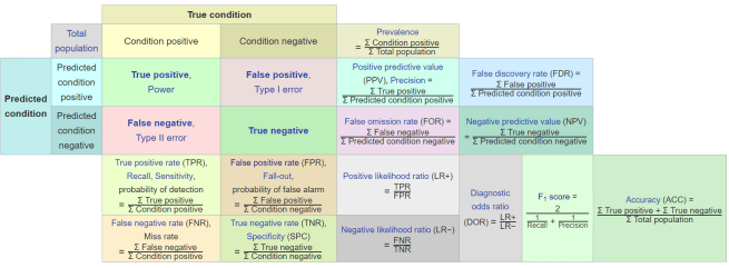
While this visualisation is total information overload, it is also one of my favourite resources for thinking about metrics. I look at it every few weeks, it is just that useful.
I know the picture is a ton to take in, so don’t spend any time on it. But it is worth pointing out that the bottom right section is where we find the compound metrics, the single numbers that include all three properties of decision making.
The highlights metrics are compound metrics, they incorporate all 3 elements of performance.
Accuracy in the furthest bottom-right is a commonly quoted metric of this type. It is defined as the number of correct decisions over the total number of decisions. This idea of “how many did it get right?” is really intuitive for humans, which is why it is strongly favoured by the media. But accuracy is a terrible way to assess most medical decision makers, because disease almost always has a low prevalence. This leads to the perverse situation where a decision maker that never identifies rare diseases will have a very high accuracy, often >99%.
Since this decision maker misdiagnoses every single case of rare disease, accuracy does not appear to be reliable as a way of measuring performance.
The other issue is that accuracy and similar compound metrics (like F1) require a specified threshold, a level of certainty above which a decision maker will say “there is a disease present”. Since the threshold is one of the dials we can turn to improve performance (however we define that for the task), it seems a bit backwards to choose a threshold before we analyse performance.
This matches what we saw earlier. Metrics with too many degrees of freedom are useless for interpretation. What we want to do is to tease out the components of performance, which we can do by (mathematically) ignoring the effects of the other components. We can turn this into a 1D or 2D problem.
In particular we want to understand the two elements that we have control over; expertise and bias.
So, to summarise the properties we need in our first metric:
- It needs to be understandable, so it needs to be a 1D or 2D metric.
- We don’t care about prevalence for now, since it is out of our control.
- Of the two remaining components, we definitely care about expertise. This tells us how “good” the system is at making decisions, in isolation.
- We haven’t picked a threshold to work at, and since changing thresholds with AI systems is trivial, we probably want to see how the threshold affects the performance.
- In conclusion, we want a way to assess the effects of expertise and threshold.
Enter the ROC
Why yes, I am going to run this joke into the ground 🙂
Last post I talked about ROC curves, and I’m going to assume readers know roughly what a ROC curve is (so go back for a refresher if needed). For now, let’s focus on the properties of ROC curves as they relate to what we have just said about good metrics.
While it might not be immediately obvious from this one picture, it is great news. In this ROC curve, we see all of the desired properties!
Prevalence invariance
Prevalence is the ratio of positive to negative examples in the data. To remove prevalence from consideration, we simply need to not compare these two groups; we need to look at positives and negatives separately from each other.
The ROC curve achieves this by plotting sensitivity on the Y-axis and specificity on the X-axis.
Sensitivity is the ratio of true positives (positive cases correctly identified as positive by the decision maker) to the total number of positive cases in the data. So you can see, it only looks at positives.
Specificity has the same property, being the ratio of true negatives to the total number of negatives. Only the negatives matter.
So while the 2D plot contains information about both classes (positives and negatives), these groups never interact. Each axis value, and therefore the curve itself, does not change at all even if the prevalence varies wildly (allowing for a little bit of jittering due to sampling bias, and a change in the threshold distribution).
If we go back to our extended confusion matrix, we can clearly see why we might choose these specific metrics.
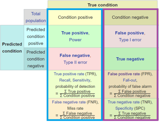
Everything in these vertical columns in the confusion matrix are isolated from prevalence.
So prevalence is the relationship between “condition positive” and “condition negative” cases. This means we can compare any values in the vertical columns to any other value in the same column, and remain isolated from the effect of prevalence. Even if we did something pointless like multiply the true positive rate by the false negative rate, and raise it to the power of the sum of the true positives, it would still be prevalence invariant.
So if you want to isolate your metric from prevalence, stay in these columns. ROC curves do this by plotting TPR vs FPR; each element is in a single column.
Expertise

Scientific American hey? I wish I could unlock the power in my pseudogenes 🙂
The ROC curve shows the probability of making either sort of error (false positive or false negative) as a curved trade-off. As I mentioned in the last post, this means that a better decision maker will have a curve up and to the left of a worse one.
I like to call this the expertise of a decision maker because it seems to match our intuition of how human expertise is distributed*. Inexperienced humans seem to occur lower and to the right of more experienced humans, in any given task. Equally experienced humans seem to define a curve in ROC space, because while they operate at different thresholds they have the same overall capability.
This property can therefore be measured very nicely by the area under the curve (AUC). The AUC roughly describes the total distance the curve is in the up-left direction, across every possible threshold. This means that AUC is invariant to prevalence, and also invariant to threshold.
Which is pretty darn cool. We wanted to look at a 2D metric invariant to prevalence, and we got a 1D metric that describes expertise for free!
As a little aside, as Alex Gossman noted recently, we can interpret the AUC in a nice way as well. The number reflects the probability of correctly ranking (putting in order) any random negative/positive pair of examples. Why this is a cool thing is beyond the scope of this piece, but it has math-y importance (it is deeply connected to the Mann-Whitney U statistic).
Similarly, for the ROC curve, the distance above the diagonal (chance) line has a nice interpretation: it is the probability of making an informed decision (a very similar stat to AUC).
Other metrics like F1 score don’t have a clear probabilistic interpretation like these, so it is unclear what they mean.
Threshold
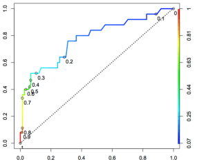
Just in case you don’t want to scroll up, here it is again!
We have already said the ROC curve shows all possible thresholds. We can see what this means in the picture above, as the thresholds are both identified as points on the curve and by the colour coding. This distribution of threshold along the curve is unique to each decision maker.
Visualising the threshold with a ROC curve is a really intuitive way to balance the trade-off between false positives and false negatives that we talked about previously. In the above picture if you wanted a decision maker with a very low false positive rate, you might pick 0.8 as your threshold of choice. If you favour a low false positive rate but you don’t want an abysmal false negative rate, you might go for 0.3 as the point where the curve starts turning hard to the right.
If you prefer a low false negative rate (because you don’t want to miss cases of cancer, for example), then you might decide that somewhere between 0.2 and 0.1 is the region where you start getting severely diminishing returns for improving the FNR any further.
The other nice feature of looking at the ROC curve is we get to see the shape of the FPR/FNR trade-off. This is not the same thing as the distribution of the threshold along the curve.
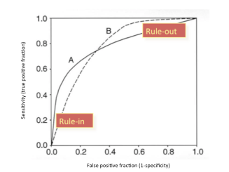
These two ROC curves, A and B, have the same area under the curve. But if you are picking a threshold, you want to know where the steepest and flattest parts of the curve start and stop. As the source of the above picture states, curve A is good for ruling in a disease. This is because you want low false positives, and curve A is very steep at the bottom left, meaning you can achieve a decent sensitivity while maintaining a very low FPR. Curve B is good at ruling out a disease, because you can have very high sensitivity while having moderate specificity.
Any 1D summary statistic of the effect of threshold will not be able to capture this property of the curve, or at least not in such an intuitive way. You could imagine a metric that describes the left-right bias as a number like 0.3, but that seems difficult to interpret.
So we can see that the ROC curve (and the area under it) can disregard prevalence, isolate expertise, and visually demonstrate the trade-offs we make when we alter the bias. Brilliant. We are ready to analyse our systems, right?
The precise prevalence
The ROC curve covers two out of three features of an “optimal” metric, in a way that is highly readable. It quantifies expertise with AUC, and it shows us how a decision maker trades off different errors at different thresholds.
But we still have that third element of performance that we ignored; the prevalence. This doesn’t matter when we compare decision makers on the same data, because the prevalence is the same. But there is a major problem here: performance is made up of all three components.
Key point:
By ignoring prevalence so far, we don’t actually know what the real-world performance is.
We need something to show the effect of prevalence. The obvious option is to give the prevalence directly. This is a known quantity of the data, the ratio of positive cases to negative cases. For example, a prevalence of 0.5 tells us that there are two negatives for every positive case.
I strongly endorse including the prevalence in all datasets in your research. Training sets, test sets, real-world data, data from referenced papers. Whatever you can get your hands on. This is very important information.
But prevalence is a statistic about the data, not a measure of performance about the decision maker. We don’t add much to our understanding of performance by including prevalence, because converting the prevalence into a performance metric (given a ROC curve) has a high cognitive load.
What we really need is a metric that shows how performance is affected by prevalence. Let’s go back to the extended confusion matrix:
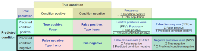
Prevalence is the relationship between condition positive and condition negative cases, so to look at how prevalence affects performance, we look across the rows of the extended confusion matrix.
There are two options here (the green or black rows), but precision or it’s compatriot the false discovery rate are the ones that are most useful for medical decision makers. Because disease prevalence is almost always low, prevalence invariant metrics like specificity fail by vastly understating the number of false positive errors we make. Sensitivity on the other hand is quite good at estimating the number of false negative errors – it actually overestimates the number in practice, but not by anywhere near as much.
Let’s do a simple example:
Our decision maker that has the following prevalence invariant metrics –
Sensitivity: 90%
Specificity: 90%
If we assume a prevalence of 1% (still fairly high, in medicine), then we see the decision maker will generate:
False negatives: 1 per 1000 cases**
False positives: 99 per 1000 cases
The sensitivity and specificity don’t reflect this at all, and thus neither does the ROC curve or the AUC. Incorporating a prevalence variant metric solves this.
Precision: 8.3%
This reflects our false positive problem much better than specificity.
To really drive this home, let us assume a similarly expert and classifier for a disease with a prevalence of 50% (pretty much unheard of in medicine).
Sensitivity: 90%
Specificity: 90%
Obviously, these metrics don’t change. They are prevalence invariant. But the real world error distribution changes dramatically.
False negatives: 50 per 1000 cases
False positives: 50 per 1000 cases
Note that the “expertise” of the system hasn’t changed, there are still 100 errors. But the precision is massively different, reflecting the improvement in the number of false positives.
Precision: 90%
Out of interest, the negative predictive value is –
NPV (@ 1% prev) : 99.89%
NPV (@ 50% prev) : 90%
I think it should be clear that in medicine, the precision says something informative about the real world performance that prevalence invariant metrics do not. The negative predictive value is also useful, but nowhere near as much as the precision.
Precision is also very interpretable for clinicians. It tells us “if the test comes back positive, what is the chance that the patient has the disease or condition?” And if you are Bayes-inclined, this is usually the same thing as the positive post-test probability. It is also very similar to the diagnostic odds ratio in this sense.
Like ROC and ROC AUC, with precision we have a great mix of informative and interpretable.
So with the addition of precision we have covered all three elements of performance! We can compare decision makers on the same data using ROC and ROC AUC, for example in a human vs AI comparison. We can also appreciate how the decision maker performs in the real world by looking at the precision. And we can understand what a positive test will mean for an individual patient.
The value of good PR
I know from many discussions I have had that you might ask: “why not do it the other way around? Why don’t we pick a threshold using a prevalence variant metric, and then report sensitivity and specificity for that threshold?”
This is a reasonable question, but to do so would require the use of a PR curve.
A PR curve plots precision on the y-axis and recall on the x-axis. The first thing to recongise here is that ROC curves and PR curves contain the same points – a PR curve is just a non-linear transformation of the ROC curve. The contain the same information, all that differs is how interpretable they are.
The problem with this is that we no longer isolate expertise, since one of the metrics varies with prevalence. This is best shown by looking at the area under the curve: while ROC curves are monotonic (meaning they always go up and right, never turning down or left at any region), PR curves are not. Thus the curves don’t have this clear relationship where moving up+left = expertise. Instead they can look like pretty much anything.
ROC curves on left, PR curves on right. The colours are matched – this is the same decision makers on the same data. I can easily tell which ROC curve is best, but I have no idea with the PROC curves.
There are other issues with PR curves: there are regions under the curve where you will never find results, that the area under the curve doesn’t add up to 1 so it has no clear probabilistic interpretation, the curve is undefined at 0, and you can’t interpolate as easily between points (like making a convex hull of doctors).
For a longer discussion, see this great CrossValidated post by an expert on the topic.
These problems don’t make PR curves useless, it just makes them much harder to interpret. Since the whole point of having the ROC curve was to disentangle expertise from prevalence in an interpretable way, I don’t like this approach. I think there are situations where PR curves are useful, but I wouldn’t suggest we start including them in all medical AI papers.
Summary
I have tried to make the case for using ROC curves, AUC, and precision as the default metrics of choice in medical AI studies. I definitely agree there will be times these are inappropriate, but for most of the studies that we are seeing coming out in medical AI at the moment, including these analyses would make the results more interpretable (and therefore relevant to medical practice).
The motivation:
- Decision making performance has three components; expertise*, threshold/bias, and prevalence.
- These three dimensions need to be described so readers can understand the performance of the decision maker.
- Humans can’t intuitively interpret three dimensions simultaneously, so we need a combination of 1d and 2d metrics.
The argument:
- The ROC AUC is a good measure for expertise, because it ignores prevalence and thresholds.
- The ROC curve is great for choosing a threshold. It intuitively shows us the trade off between false positives and false negatives in a way that other methods (like PROC curves) do not.
- The precision highlights the real world weakness of the decision maker in a low prevalence environment.
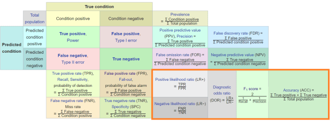
I said before I love the extended confusion matrix, despite how messy it is. Here is why: you can simplify the matrix into ‘zones’ that reflect these properties.
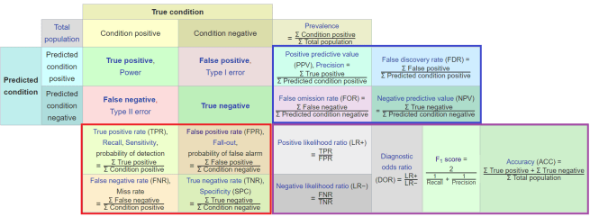
Red (bottom-left) = prevalence invariant metrics. Blue (upper-right) = prevalence variant metrics. Purple (bottom-right) = compound metrics.
In each of these zones, the statistics serve roughly the same purpose and have the same benefits and weaknesses.
My opinion is that we will always need at least one prevalence invariant metric and at least one other metric, be it prevalence variant or compound. This metric should describe the imbalance towards false positives, because in low prevalence settings like medicine this is the major problem we will face. This leaves us with precision, the positive likelihood ratio, the diagnostic odds ratio, and the F-score.
I find the compound scores are much less interpretable, so I prefer precision.
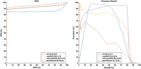
So, let’s put it into practice. Here are some results from one of our recent pre-prints about detecting hip fractures on pelvic x-rays.
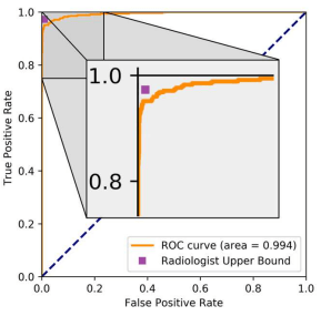
We first look at the ROC curve to estimate expertise with AUC, and to identify a threshold we might want to use. This shows that our model, despite an absurdly high AUC, is still better at ruling out hip fractures than ruling them in. Using a high specificity operating point is probably “better” than chasing an extremely high sensitivity, if it makes clinical sense (it does).
So great, we have an operating point candidate. But we still don’t know what performance is like in patients, because ROC analysis is prevalence invariant. So we add in the precision (and a few other metrics, because the paper we were comparing to included them).
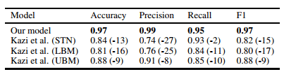
This table compares against the previous state of the art, which used an enriched test set at 50% prevalence. This gives us a nice baseline for precision, and we can see how strongly it is affected by prevalence. Clinical prevalence in our dataset, with the results in the table below, is around 12%.
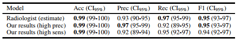
So at two selected operating points precision is still good, but nothing like the 0.99 we saw above. We can also see what the ROC curve hinted at – to achieve good sensitivity, the precision drops quite a long way. Even if the specificity was an overestimate of how well we do with the negative class, the shape of the curve was still informative.
With these results we can interpret the value of the model at a glance;
in this data, at a sensible threshold, the model will miss 5% of hip fractures, and a patient with a positive label will have a 92% chance of having a hip fracture.
When we are writing our papers, it is easy to present these additional metrics. It doesn’t take up a lot of space, most of them are one line of code to produce, and it can reassure readers that they understand all of the different elements of the model’s performance.
I strongly believe there is never a good reason to present a single metric in a medical AI paper.
BONUS MATERIAL!
I wanted to include this higher up, but it didn’t really fit anywhere. Consider this a supplement, which may help with reinforcing some of the ideas we’ve covered. I personally find visualisations very helpful, so this is the stuff that would have helped me when I was learning.
Let’s have a look at our dials again.
We want to improve expertise, we can twiddle the threshold/bias, and we have to be aware of the prevalence. But what does turning any of the dials look like?
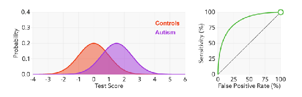
Important side note: I was going to make all of the figures below myself, but it turns out someone has already done so, brilliantly. All credit for the below figures goes to Tim and Jon Brock, who have a fantastic piece on Spectrum about the analysis of biomarkers for autism diagnosis. I hope they don’t mind me cribbing their images 🙂
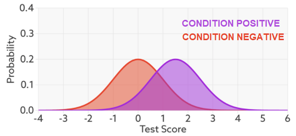
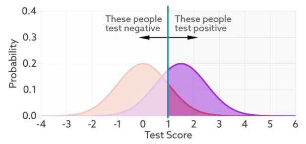
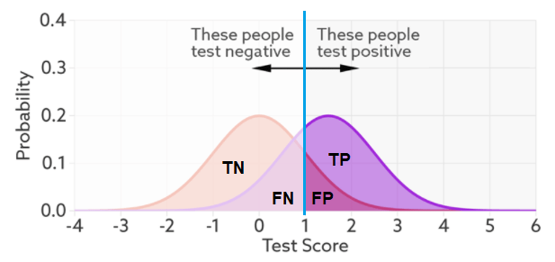
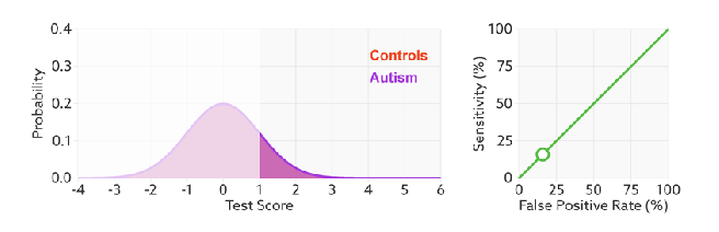
This is called a probability density function plot. Given some test (in this case, a decision maker with a “certainty” ranging from -4 to +6, whatever those numbers mean), it shows the distribution of patients with and without the condition. They overlap because the decision maker is not perfect – it gets the overlapping ones wrong. To make a decision, we choose a cut off value on our score (a threshold), shown in blue below.
This is the exact same thing as our confusion matrix – the numbers of true positives, true negatives, false positives, and false negatives. So we can see that with this threshold, there will be more false negatives and less false positives.
Now, we want to look at our three elements; expertise, threshold, and prevalence. For the first one we can take the same data and draw a ROC curve.
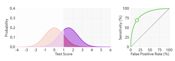
In this case, the threshold has been picked already, and we can see that reflected as the open circle on the ROC curve. But we want to use our ROC curve to select a threshold. What happens when we vary the threshold?
We see varying the threshold moves the position along the ROC curve, but the curve is unchanged. This makes sense, the threshold changes the ratio of true negatives to condition negatives, and true positives to condition positives, but it doesn’t change the expertise of the decision maker.
But that raises the question – what is the expertise?
Expertise is how well the decision maker can separate the classes^. The less overlap, the fewer errors and the further the ROC curve moves up and left.
And this makes sense in the setting of deep learning too. When we optimise log-loss, we are trying to push the classes as far apart as possible. So we can see the direct comparison here: the better we separate our classes (the better trained our model), the higher AUC will go, unrelated to threshold or prevalence. This is why I think expertise is proportional to AUC^^.
The other thing this shows really nicely is that while the number of errors changes with expertise, the number of condition positive and condition negative cases does not. The prevalence is unchanged.
So we need to visualise the final element: what happens to our probability density functions and ROC curve as prevalence changes? Knowing what we do from the rest of the post, we would expect the proportional size of the peaks to change, but not the ratios that make up the ROC curve. Turns out this is spot on.
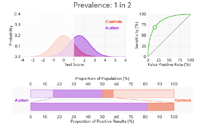
The ROC curve stays the same because the ratio to true positives to condition positives stays the same (likewise TN:CN). But the ratio of true positives to false positives changes dramatically. The two-coloured bar on the bottom reflects the precision, and it goes from above 80% to below 10% as the prevalence changes.
For an even cooler way to explore these trade-offs and interactions, go to the piece by Tim and Jon Brock and check out their interactive visualisation at the bottom of the page.
So, there you go. My own preferences for performance testing in medical AI, explained as best I can. Hopefully somewhat interesting, and somewhat useful.
For researchers, I think in any medical AI paper where we are making some claim relevant to clinical practice:
- We need to do away with single performance metric results. No single metric can adequately describe the performance of a medical AI system.
- We need to set aside a figure and a table for reporting results. No figure alone can cover everything. A table with multiple metrics is better, but it is still not comprehensive and it is harder to interpret at a glance.
- We need to be cognisant of prevalence, and if we are relating our claims to clinical practice, we should attempt to contextualise them in the setting of clinical prevalence.

Luke, Thank you for writing this summary. I’ve always defaulted to the ROC metric, but I was interested in reading your thoughts. Are you aware of any metrics incorporating the costs of false positives vs. false negatives into the metrics? It seems like this would be important in medicine and financial lending. -Clayton Blythe
LikeLike
“Are you aware of any metrics incorporating the costs of false positives vs. false negatives into the metrics?”–Hi, Clayton, I think ROC has this property already.
LikeLike
Nice Post! Hi Luke, I have a question that bothers me for a long time. If I encounter a problem of low “prevalence”, and the precision of my model is relatively low, in the absence of comparison model, how can I confirm the precision can reach what level?and how good is my model right now?
LikeLike
Good introduction to oft-cited (and not so oft-understood) concepts. I’ve got only one doubt, if you got the point when you say “Expertise is how well the decision maker can separate the classes^. The less overlap, the fewer errors and the further the ROC curve moves up and left”. I would see the two curves (the red and the purple one) differently. They represent, respectively, the frequency a negative (red) subject has got test score x (while being negative), and the frequency a positive (purple) subject has got test score x (while being positive of course). So it’s not the expertise of the decision maker to separate them, but.. chance. Do you see what I mean?
LikeLike
Hi Luke,
Maybe it should be highlighted that the ROC curve does not change with prevalence _if_ the cases in the new population with different prevalence are just as easy/hard to classify as in the original population, but this is very rarely the case in practice.
Say I am detecting green chairs, and I’m being tested on a set of 50% green chairs and 50% red chairs and I happen to be colour-blind. My ROC line is the diagonal, and it seems like I can’t tell what a green chair is for the life of me. They move me to a test set with 80% green chairs and 20% red chairs, and my ROC curve doesn’t change, still a diagonal. And yet out in the world of blue chairs, red dinner tables, and black cats, my specificity goes way up, and my ROC curve looks completely different.
Similarly with the classic Bayesian examples of the AIDS test that is 99% specific, etc
LikeLike
Hi Ale, thanks for the comment. I did mention this issue (obliquely) when I said the ROC curve jitters with prevalence changes (the so called “spectrum effect”).
The reason I don’t make more of it here is that we are talking about (mostly) phase II medical AI systems. The entire purpose of these systems is to show us what real world performance might be like. If the dataset is different enough from the real population to lead to major ROC changes as prevalence changes, then the whole premise of the study is fatally flawed.
LikeLike
Reblogged this on Marketing Analytics.
LikeLike
Hey Luke, I really like your post!
Just one comment:
” The ROC curve achieves this by plotting sensitivity on the Y-axis and specificity on the X-axis.”
I think you later correct this on the text, but shouldn’t it be false positive rate (FPR) or Fall-Out measure on the X-Axis (1-specificity) ?
LikeLike
Thank you for you post!
However, I am a bit confused by the fact that your clear results ROC curves does not translate in an equivalently clear result in PROC curves. Indeed there is a highly-cited paper (please see the URL below) stating that:
Theorem 3.2. For a fixed number of positive and negative examples, one curve dominates a second curve in ROC space if and only if the first dominates the second in Precision-Recall space.
Click to access rocpr.pdf
Thanks!
LikeLike
Minor correction: “a prevalence of 0.5 tells us that there are two negatives for every positive case”, shouldn’t that be a prevalence of 0.33?
Good stuff! Really useful, keep it up 🙂
LikeLike
Thank you Luke,
What are your thoughts about this paper: https://arxiv.org/pdf/1710.05381.pdf
Where they see AUC ROC suffer with class imbalance and that this decremental effect due to class imbalance is compounded with the complexity of the classification task.
They also address the question of ” whether the decrease in performance for imbalanced datasets is merely caused by the fact that our imbalanced datasets simply had fewer training examples or is it truly caused by the fact that the datasets are imbalanced”. My understanding is that the effect of imbalance is independent of the number of training examples.
Does this argue against the notion that the AUC ROC is prevalence invariant in ML applications?
Thanks!
LikeLike
Hi, thank you for this very interesting article. I am a resident in veterinary dentistry at University of Montreal. I would like to reproduce an adapted version of the 2×2 table of your article to present the results of my research on the evaluation of a diagnostic tool. I would appreciate if you may confirm your authorization by email at caroline.proulx.2@umontreal.ca. Thank you for your collaboration. Best regards.
LikeLike